Nectar Honey-
Brand Identity Design
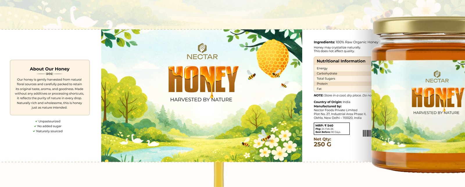
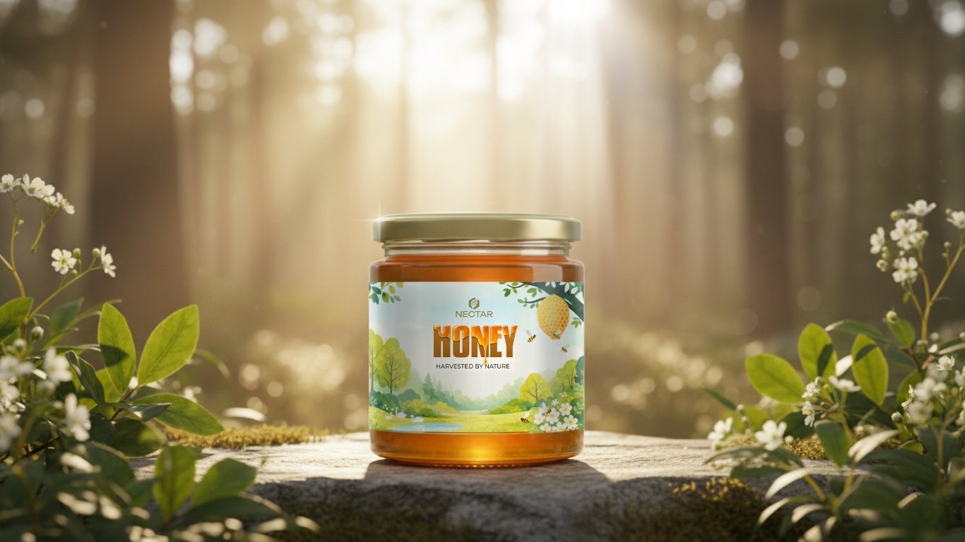
For Nectar Honey, the objective was to elevate honey from a regular grocery product to a refined, design-led brand. The identity was built to communicate purity, origin, and strong shelf presence through a clean and cohesive visual system.
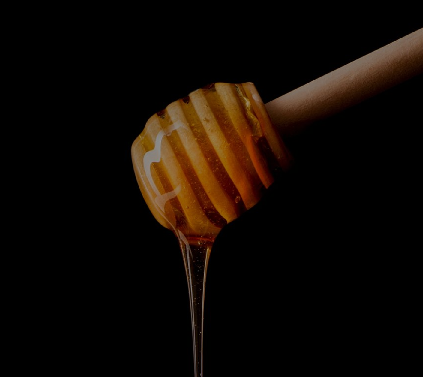
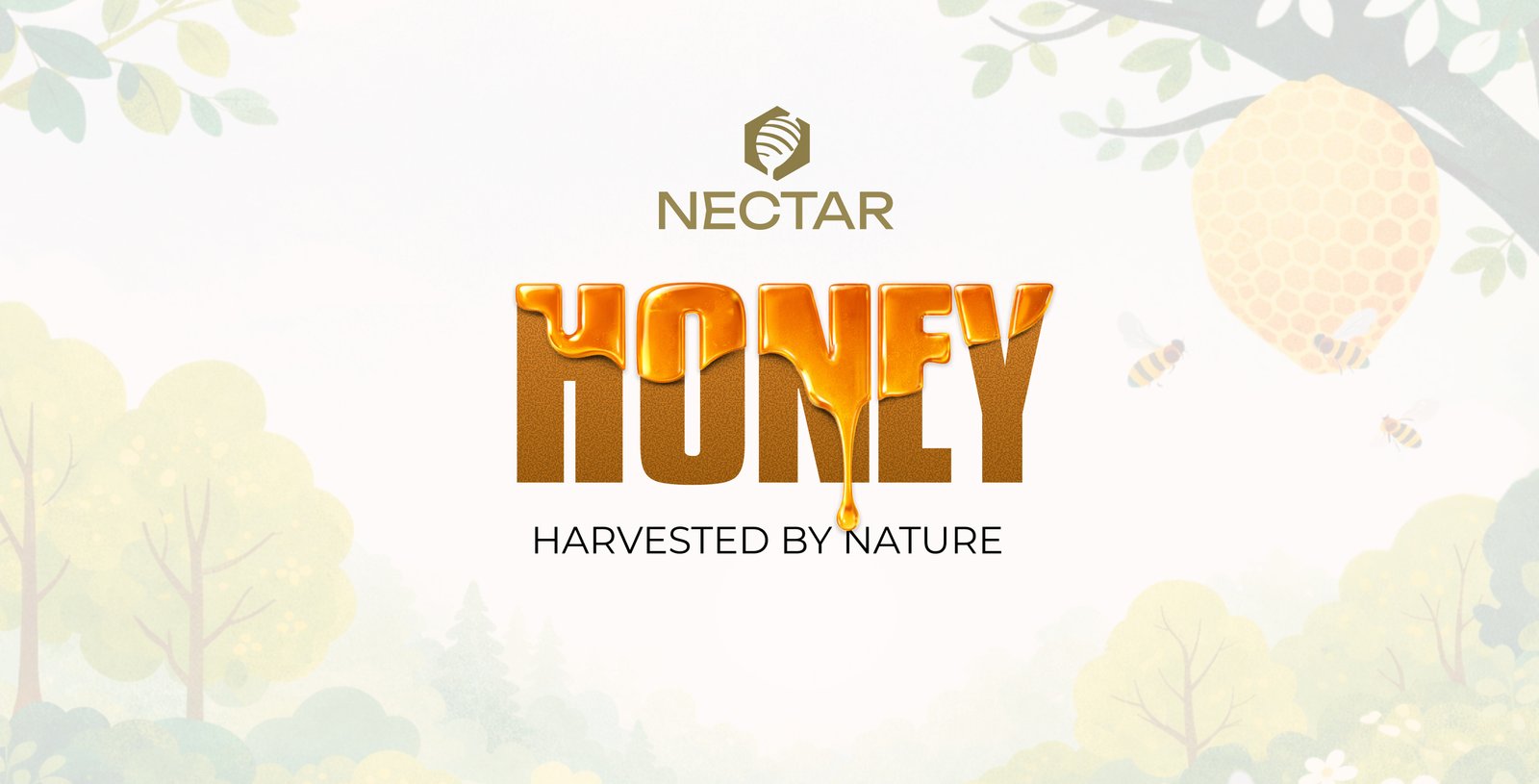
The custom typography draws inspiration from the natural flow and viscosity of honey, with select letterforms partially enveloped in honey to create a subtle yet distinctive visual hook. This strengthens memorability while directly reflecting the product’s essence.
Hand-drawn forest illustrations on the label reinforce the brand’s connection to nature, visually representing the honey’s source while adding depth and character without overwhelming the composition.
The result is a modern, confident brand system where typography, illustration, and minimal layout work together to enhance clarity, build consistency, and establish strong recognition in a crowded category.
Logo Design
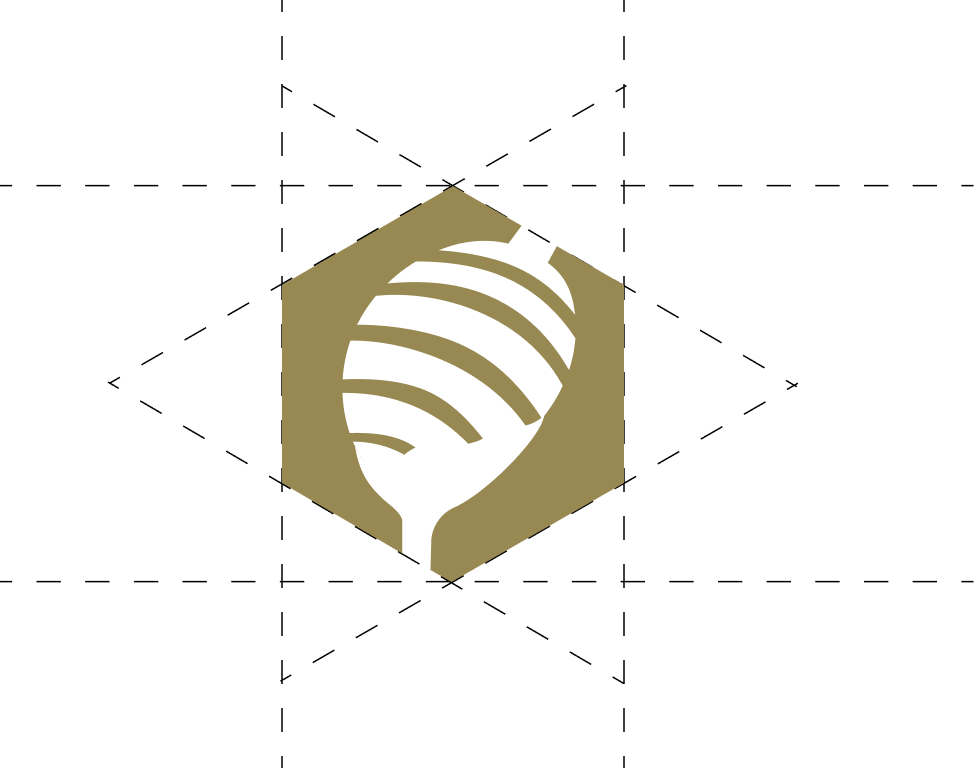
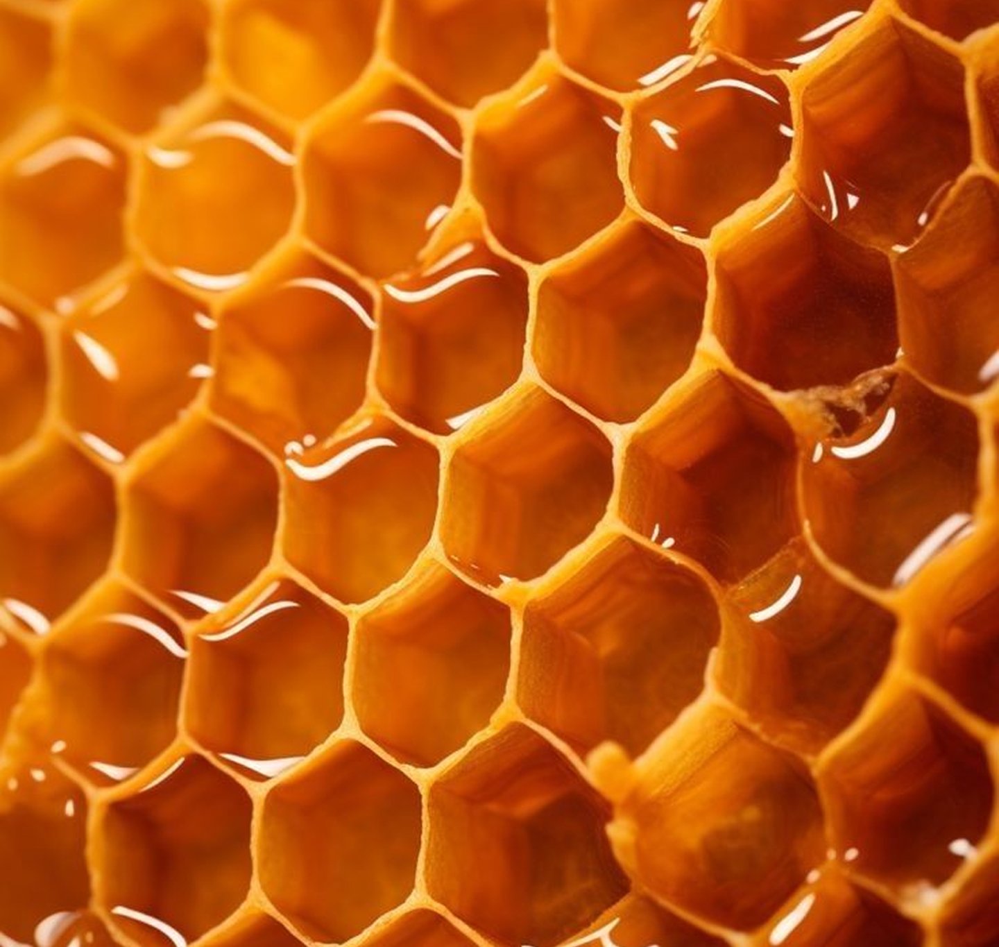
I took inspiration from the honeycomb structure and incorporated a hexagonal form to give the logo a strong and distinctive shape.