

Bringing the goodness of
makhana to the modern shelf.
Nutsley was developed around a simple idea: present a familiar Indian
ingredient in a way that feels premium, contemporary and easy to understand.
The packaging needed to communicate quality at first glance while retaining a
connection to its Mithila roots and Indian origin.
CLIENT
Healthyfye Foods Pvt. Ltd.
CATEGORY
FMCG, Food &
Beverages, Startup
SERVICES
Packaging Design,
Brand Strategy
Rooted in tradition.
Designed for today.
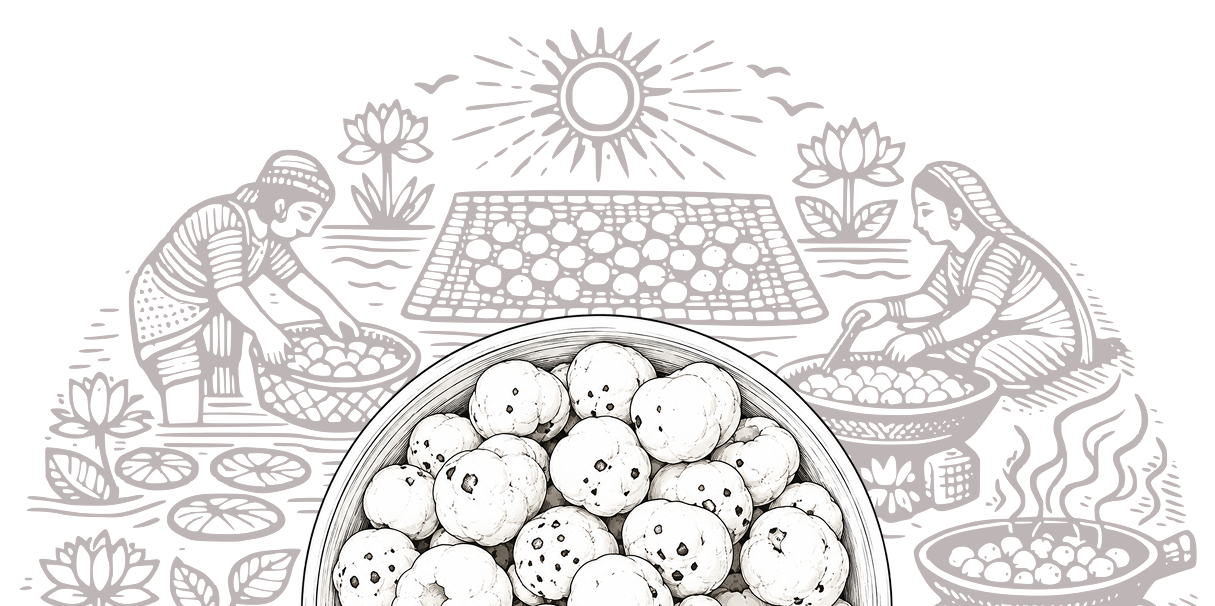
The visual direction combines Indian visual cues
with a clean, contemporary packaging system.
Rather than making the pack feel overly
traditional, the design uses restrained illustration,
typography and colour to create a balance
between heritage and modernity.
FIRE-
CRACKER
#B3571D
SILK
SILVER
#97AC48
CLASSIC
SALTED
#7ACCED
CHEESY
BLISS
#F8B510
SIMPLY
ORIGINAL
#E7CCA1
SMOKY
BBQ
#8A2817
Typography
KENYAN
COFFEE
ASAP
Kenyan Coffee adds boldness and a strong shelf presence, while ASAP keeps the packaging clean, modern, and easy to read. Together, they balance heritage with a contemporary feel.
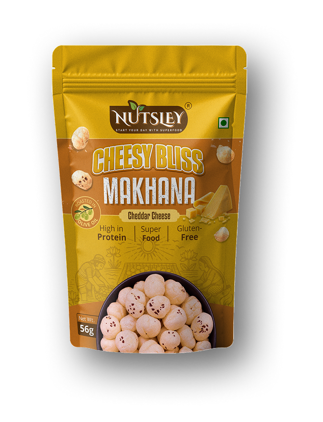
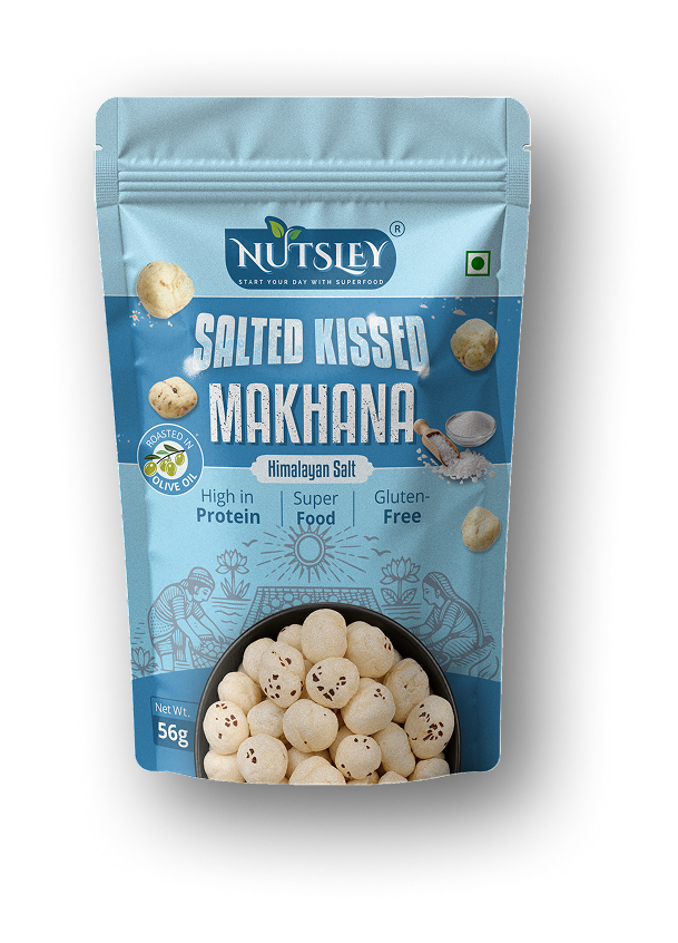
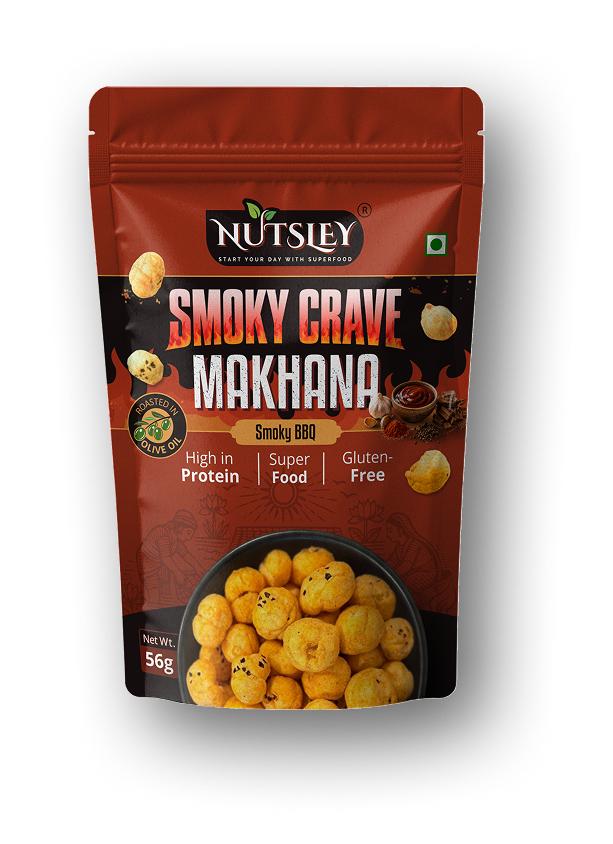
One identity.
Six expressions.
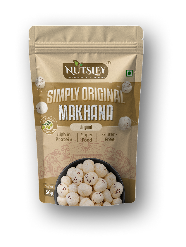
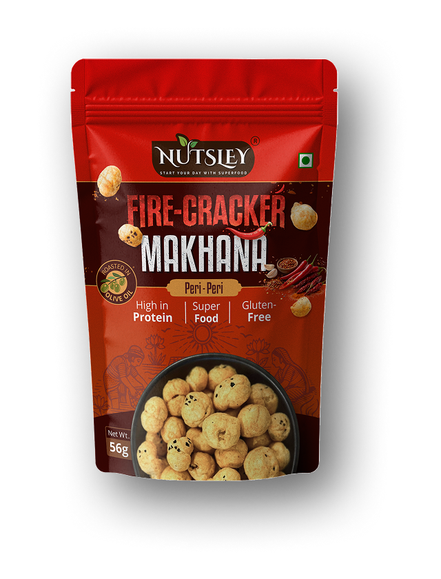
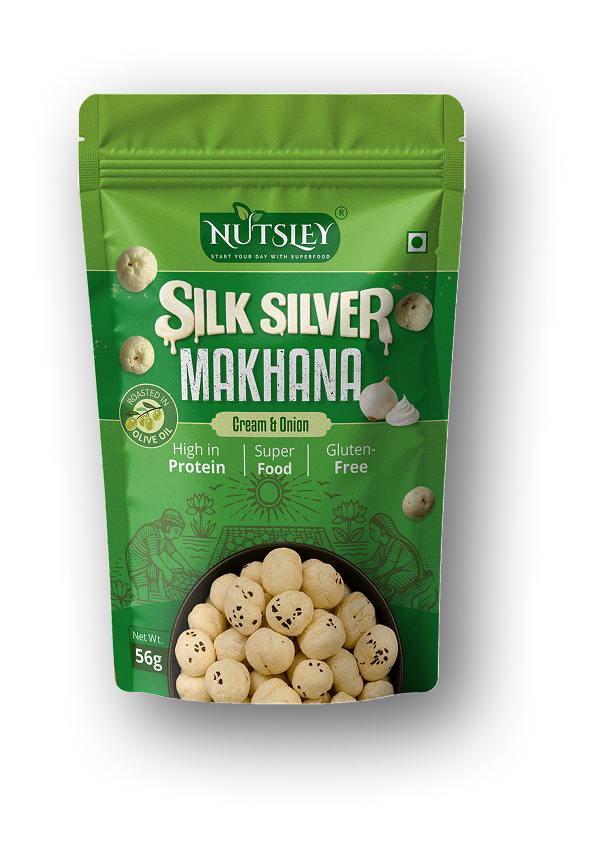
What stays
Brand identity, typography, pack structure
and information hierarchy remain consistent
across the range.
What changes
Colour, flavour expression and visual
personality shift to make every variant
instantly recognisable.
Designed to be noticed.
The packaging uses bold product hierarchy, distinctive colour and a clear information structure to create recognition across the range while maintaining a premium feel.






Rooted in where it comes from.
Designed for where it's going.
PACKAGING DESIGN · ART DIRECTION · VISUAL SYSTEM